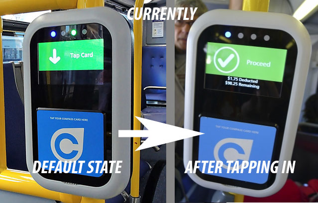
One reason she couldn't tell might be because her card can end up covering part of the screen. But the main reason I believe, is that the default start screen, which prompts you to "Tap card", shouldn't be green and then still be green after a (successful) tap. (It does change red, if the card was misread). In the half a second it takes to tap a card and board a bus, while other people are waiting behind you, with an old immigrant lady, with limited English and a different generational tech experience - you want an interaction with the interface to be as understandable as possible and not prone to "user error".
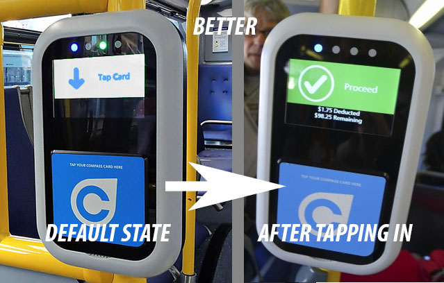
The Default screen should be of contrast to green (I would suggest white or light blue to go with the Compass branding) and then change the screen to green on tap (as the color green is synonymous with good, go, or complete). As well, the beep on tap from the bus readers needs to be MUCH louder, as it is barely audible (should be loud enough and at a more noticeable frequency to be used on a noisy bus or station).
Good suggestion! There's just too many things that can be improved on the current system. They should get you on board the redesign.
 Links
Links